Visual clichés to avoid in a presentation
If you read an article online about a designer’s best practice for presentations, you’ll be told to reduce text on slides and use more visuals, and this is good advice. Everyone likes images, sure, but badly chosen generic clip art won’t have the effect you want either. We all know those visual analogies that come up again and again. It becomes an easy, and lazy, language to include in your presentation to add some colour to a slide of text. However, your slide visuals shouldn't be an afterthought, they are be a vital part of the communication of your ideas.
Over the years, working as a designer in tech, finance and marketing, I have noticed the same tired visuals coming up repeatedly to illustrate some simple messages. When they are overused, they eventually become meaningless and no longer have that high impact that you want on your slides. Another ‘lightbulb’ moment, another ‘Like’ icon and there’s that same woman in smart business attire giving you a manic smile from behind her logo-free laptop in a stark white office. Before we go into issues with stock photography, let’s talk about visual clichés to avoid:
Lightbulb
Thumbs up
Handshake
Rockets
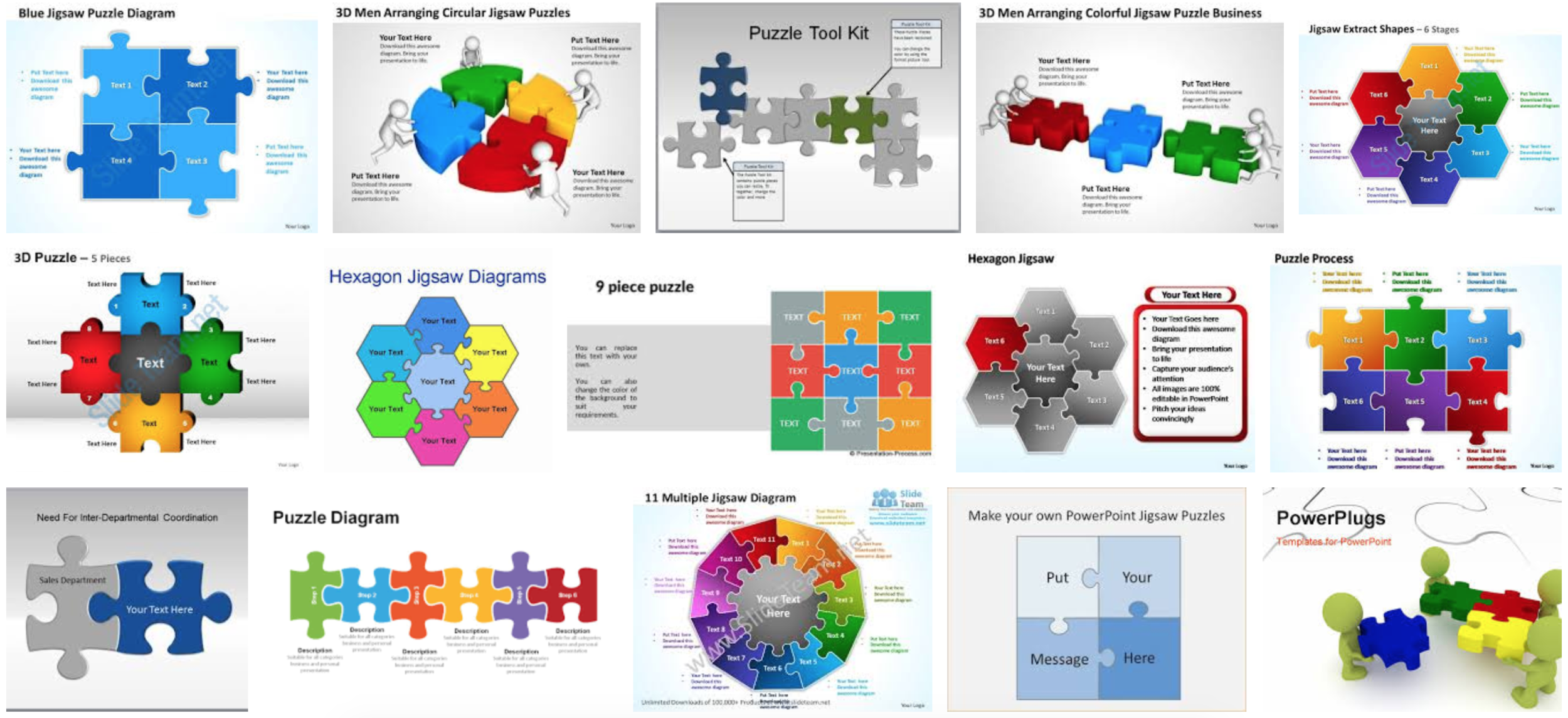
Puzzles
If you need some more reasons to avoid these common images just take a look at the slide templates that are all over the internet.
Lightbulbs to illustrate a new idea or a solution
A lightbulb isn’t always a good idea. This is one of the most overused images in presentations, especially in B2B marketing. If you are trying to say that your product, service or solution is new and exciting, a tired cliché isn't the best way to do it. Rather than using this shortcut to say ‘I have an idea,’ tell us your idea. Try to show your process or how you got there. What impact will your idea have on the audience?
Thumbs up to illustrate approval and ‘Likes’
Can I get a thumbs up? After the introduction of the ‘Like’ button, our presentations are littered in approval. Work on making sure that your message is clear and interesting so that you don’t need to prompt your audience to like you.
Handshakes to illustrate agreement and co-operation
Business deals, projects, teams, pals – everyone’s shaking hands. Depending on the relationship, there are many different stories to tell. Have you made a deal with a new partner? Are two firms working together on a project? Try to look at what makes this story different and what is bringing the two sides together.
Rockets to illustrate launching, ambition, beginning and innovation
Rockets are used for every new launch but unless you are NASA, you are not heading into orbit any time soon. Think about some visuals closer to home and ones that will represent your industry and ideas in a clearer way. If your story is about a journey, tell us how are you getting there. If your story is about a new project, tell us what problem it’s solving.
Puzzles to illustrate things coming together or connections
So many puzzles, so little time. The jigsaw puzzle is one of the most common visuals used to illustrate connections and elements coming together to create something bigger. I have seen them in every size, shape and colour. Work on illustrating your ideas or process as infographics in a way that will add more meaning.
Finally, combining any of these visuals is to be avoided at all costs.
Some visual recommendations
Try to use photos instead of clipart and people instead of abstract things but please make sure you have the rights to use them.
If you do have to illustrate a new idea or a concept, spend a little longer thinking about your visuals and include them in your slides from the beginning, not as an afterthought.
Hire a designer who can tell your story in a visual way and add unique and creative ideas to your presentation. If you need advice on where to begin, Cova can help.
If you are looking for more help with your presentations contact us.
Photo by Hush Naidoo Jade Photography on Unsplash


